Categories
Product

Do mobile user education right

Redlaser 4.0 Mock

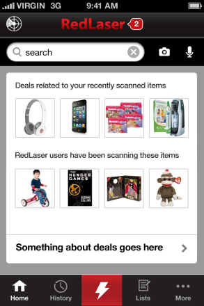
When we were designing RedLaser 4.0, one of our biggest questions was now to handle navigation. In particular, we weren’t sure where to put the button that launched our barcode scanner. It’s a critical function, but we were adding more features, so we needed to make sure it stood out.

We put it at the very center of our navigation bar, with a giant scan icon. We made the background red, so that it would really pop.

Sure, the app wouldn’t boot straight into the scan mode — we wanted users to see all the new features — but we were sure we’d done the next best thing.

The design failed, horribly, in testing. One user, a long-time RedLaser user, spent fifteen minutes trying to figure out how to launch scanning. She later told us she hadn’t even noticed the button.

This is a common story in mobile: Complex user interfaces are extremely hard, and a UX change can backfire in unexpected ways. If a button isn’t explicitly labeled and visible above the fold on the home page, it will get exponentially less usage.

This is a challenge: Phone screens are too small to show an explicit user interface for all but the simplest apps.

RedLaser isn’t alone in facing this issue. Swarm is a gorgeously designed app from Foursquare. It is the culmination of FourSquare’s efforts to re-envision and dramatically simplify the check in process. To do this, by default it continually broadcasts your current neighborhood to your connections. FourSquare realizes that while this behavior is critical to the app, it can also be really creepy: you don’t always want your friends to know when they’re nearby.

A very important part of the interface, then, is turning this tracking off. It’s easy, but also a new interaction element: You swipe left-to-right across the top bar and it changes your state:

FourSquare

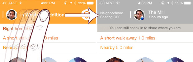
While this interaction approach is easy and smooth, Swarm’s challenged because it isn’t a kind of interaction users expect — and there’s no explicit text to let you know it is even an option. Even savvy mobile users find it hidden:

https://twitter.com/danielbachhuber/status/474018824857989121

This leaves developers two choices: Build simpler apps, or teach users.

It looks like many of the largest companies in mobile are choosing the former. The triumph of Whatsapp is its focus and simplicity — and it is followed by focused apps from eBay, LinkedIn, Amazon, Google, and more. A single-purpose app can create a focused, simple, user-interface.

A single-purpose app, however, just creates different problems: User acquisition, and user retention. Big mobile companies with their own ecosystems can use apps to feed each other (just like clicking an eBay link in RedLaser will send users to the eBay app). The vast majority of mobile players don’t have this luxury, and user acquisition can be brutally hard. So when you’ve convinced a user to download your app, it needs to be a must-open, home-page-worth app — and this frequently will mean complexity.

Most app developers can’t afford to fragment their user base. So complex apps need to get user education right.

User education, however, is hard. The most common approach is to show an overlay on launch, calling out a few critical buttons. In Swarm, FourSquare insisted every user disable and then re-enable location tracking before permitting wider use of the app. Others require users to watch short videos or swipe through pages of text.

None of this works. Most users in a new app want to get up and running as quickly as they can. We’ve all been guilty of furiously button mashing through tutorials, trying to get to the meat of the app. So what should a designer or product lead do?

The most impressive user education system I’ve encountered is, surprisingly, for the app Secret. Secret is a social sharing app whitest people anonymously broadcast information.

Secret uses three complementary approaches to user education

Method 1: The traditional tutorial

Secret starts with a traditional user education flow When a user opens the app for the first time, they need to swipe through a series of screens describing the basic operation of the app. This happens before registration, which is important so that users get a sense of how the app works and aren’t driven to close or delete immediately. These screens are extremely simple, focusing on concepts rather than on specific functionality.

At RedLaser, we found people swipe through this kind of screen extremely quickly. The default assumption should be that the average user will not see this content.

HighlightsMethod 2: In-line education

Secret’s first innovation in user training is inline education. The key interface for the app is a user’s secret feed. When a user pauses to read a secret, it is blurred out and a single, focused, explanation of a user interface element appears. These messages are contextually relevant — they only appear when the user pauses to read a message that could benefit from further explanation.

The advice is effective and powerful because it is highly relevant to the user’s current situation. The messages either suggests a specific action the user can actually take on the secret they’re reading right then, or it provides context for the secret (if not from a friend) which makes the secrets more valuable.

Exiting these messages requires a click in a small area, and the exit button changes location (following the messages), which means that users can’t quickly skip through the messages.

Inline-NotesMethod 3: Spaced Retrieval Therapy

Secret’s final training method is spaced retrieval therapy. In SRT, you regularly re-expose people to information to lock it into their minds.

Secret uses this for key pieces of information: How to like secrets by swiping left to right (critical because this determines whether and how secrets are shared), and permissions requests.

This information is displayed inline, just like a normal secret, which means users are less likely to block the content out (as in banner blindness).

It isn’t clear when Secret decides to show this information. To most effectively train people about interfaces, they should display the information on a regular pattern with decreasing frequency (e.g., after 1 day, 3 days, 7 days, 14 days, 30 days, etc.). If a user positively responds to the content (for example, by taking the action without prompting), the frequency of reminders can become less frequently.


For other posts on mobile, read about the trend of increasing apps per company and iOS 8’s major pro-privacy changes.

Categories
Product

App Disaggregation’s Physical Limit: 30 apps per device

eBay Marketplaces: 3 apps (Core, Fashion, Motors)
Facebook: 5 apps (Core, Messenger, Whatsapp, Instagram, Paper)
LinkedIn: 3 apps (Core, Contacts, Recruiter, and until a few days ago, CardMunch)
Google: 36 apps (ridiculous)

Across mobile, the companies most serious about mobile are disaggregating their features sets and building new, more focused, apps. There are compelling reasons to split up your apps:

  • Apps get one chance to get key permissions from the user — push and geo, in particular. With multiple apps, you can ask multiple times, and users might have a clearer understanding of why the permissions are necessary. And if one of a company’s apps annoys users, the users are less likely to totally cut out that company (by revoking permissions in all apps).
  • Smartphone screens are small — even on the largest Android devices. Focused apps can have simpler user interfaces, without hidden features. If a button isn’t visible, most users will never find it. This is why Facebook removed their slide out navigation panel and why Venmo’s right nav surprised me. RedLaser has a left navigation, but we find that users are orders of magnitude less likely to use any features there.
  • Updates take time on iOS. If you’re testing new features which might anger customers or be unstable, it’s better to test in less important apps and eventually roll the best and most stable features into the core experience.

However, most users don’t have many apps on their devices: Surveys suggest users have only gone from 31 to 33 apps on their devices over the past five years. (See my data here.) Moreover, most of these apps are likely games.

Average Apps per Device

If users don’t have more apps, who is using these more focused apps? A few hypotheses:

  • Power-users use anything other than the core apps (and maybe Whatsapp). App manufacturers can create power tools for some users without distracting most of their user base.
  • Apps from powerhouse developers are beating out smaller companies. eBay/Facebook/Google/etc. have a larger share of the install base than they did 4-5 years ago.
  • None of the ancillary apps have significant install bases. They’re purely used for experimentation, and all the successful features will be rolled into the core apps.
  • The cohort of users with smartphones in 2010 might have many more apps installed in 2014 — but the average is weighted down by new late-adopting smartphone users.

I suspect all these explanations hold a bit of truth. It’ll be an interesting place to watch — particularly because discoverability of installed apps becomes a huge issue once users have 100+ apps. I’m already at the point where any apps off my home screen are accessed via Apple’s built in search feature or Siri.

Categories
Product

Top PMs are top trusted advisors

I’m a huge fan of Quora. I have no idea if it is sustainable as a business (and get a bit flabbergasted by its regular, and enormous, rounds of funding), but there are few other places where you can find reflections on the height of the author of Dinosaur Comics author Ryan North and the valuations of small, private, startups on the same website.

One of my favorite answers is from a general manager at Amazon, who ponders what distinguishes a top 1% product manager from a top 10% product manager. I’m particularly struck that the respondent (Ian) goes beyond the typical trite description of the role — “Product owner,” “mini-CEO” — and lays out very detailed and particular activities he thinks sets the greats apart:

  • Think big
  • Communicate
  • Simplify
  • Prioritize
  • Forecast and measure
  • Execute
  • Understand technical trade-offs
  • Understand good design
  • Write effective copy

(He goes into more detail in his answer.)

What struck me about this list is that the defining characteristics of a great product manager are also the defining characteristics of the greatest consultants I’ve known — and the greatest lawyers, and marketers. At its heart, answer suggests that a great product manager is a great trusted advisor.


Categories
Product

Uber’s business model: What does last month’s SF price decrease mean?

In January,  Uber announced it was dramatically slashing rates for UberX cars. With the new rates, UberX cars are the lowest priced transportation option I can find in San Francisco.

Techcrunch and other venues posited that this was a purely competitive move: Consumers were trying out alternative services like Lyft, and Uber needed to be cheaper to compete. While I’m sure that’s part of the story, I think there’s something more going on.

The ride share service is brutally competitive — and not just on the consumer side. It puts enormous power into the hands of drivers, because people don’t just want low rates but also supply. One impact of this is that the economic surplus will probably accrue to drivers — services will compete to pay them a larger and larger percentage of the total charge just to get them driving for their service, rather than a competitor.

Moreover, since the people using services like Lyft and UberX are extremely price sensitive, the best way to get new customers is to lower rates. Overtime, you’ll probably see movement like this:

Profit curve for ride share businesses


Prior to January, it looked like profit for ride share businesses would slowly decline as prices dropped and drivers took a larger and larger percentage of revenue.

Uber’s January move changed that — they jumped from A straight to B on my chart, instead of slowly bringing down prices. Since they didn’t reduce the absolute dollar value of driver revenue, the drivers effectively take a higher percentage of revenue.

So what? Uber just kicked off a price war … because it is one they can win. 

See, the above curve is  only true for community drivers. Black car services are a totally different market — you differentiate on service and convenience, not  price. This is a market Uber owns.

Uber’s main concern is about winning marketshare & press in the broad taxi service (possibly because they see a future with driverless cars, where capital is more important than labor, and they’ll win back their profit margin), and about making money via Uber black car. 

Which gets to another reason for the price decrease: To better differentiate its services: Uber vs. UberX.

Uber Business Model

Prior to this price decrease, Uber had better service but otherwise wasn’t much different — a bit more expensive.

By lowering prices (and forcing its competitors to do the same), Uber actually might have reduced the number of cars on the road. Suddenly there is a huge competitive advantage for the black car service — they’re simply more available, all the time.

Categories
Product

Why freemium’s only going to get more common

Localytics, via Techcrunch
Evernote blog, via Markitecture

These two charts, taken together, are what have me convinced that freemium is going to be the dominant business model for any serious application in the future.

What these charts tell me:

  1. Mobile applications either win or lose; users try lots of apps, decide which they like, and then use those few heavily
  2. Users are willing to pay for apps they use heavily

The key, then, is how to convert users into heavy users, and thus convince them to pay. Evernote, Dropbox, Pandora, and others find the freemium model well-suited to this–get lots of free-users, offer a compelling product, and convine the heaviest users to shoulder the majority of the cost.

There are other options. Microsoft and Adobe are able to jump immediately into a relationship via their reputation and business lock-in. But I suspect the days of such uniformity are drawing to an end. Google Docs, Evernote, and a whole suite of applications threaten the Office lock-in. Adobe and PDFs, another must-have software set, is also on the decline.

I can imagine the freemium model expanding to other industries. Amazon’s announcement of free book rentals is an interesting stab at a physical-world freemium program–users still need to buy (subsidized) Kindles, but it seems like their goal is to lower the trial costs as much as possible, and encourage the heaviest users to come in with gusto.

There’s real money to be made in figuring out how to apply this pay-gradation to other industries. I could imagine it would be effective in video, in particular.