Miles Skorpen

  • Memorial: John Skorpen

    Memorial: John Skorpen

    My father, John Skorpen, passed away in April 2020. He was 78. Below are my remarks from his memorial service this past August.

    Last week, I was up in the Adirondacks. 

    In a break in rain storms, Kathleen and Abby and I hiked Mnt Catamount. It’s a mountain I hiked with dad maybe a decade ago. I think it was the last big mountain we hiked together. I don’t know if you’ve ever hiked a mountain with dad, but whenever you got to the summit, he’d immediately look to the horizon, searching out other mountains. 

    “Look,” he’d say, “there’s Ampersand! There’s St. Regis! Ah, that’s Lion mountain … you’ve got to bushwhack to summit that one!” 

    He always could name every peak, and seeing them on the horizon would get him fired up. He’d immediately start plotting a route up. The more off-the-beaten path, the better. Every hike added to his backlog of adventures. He had a list of adventures a mile deep. 

    Years ago, when I was in fourth grade, we took a family trip to Europe. Dad joined Evan, mom, and me in Switzerland, and we headed south to Italy. Every night in Italy, he’d pour over the local maps, and he’d find us adventures — a little castle icon, just a few hills over. 

    We’d set out in search of these Italian Castillos. He’d have us driving for hours down tiny Italian backroads, and we’d finally come across a small, ancient, but not-too-impressive walled village. 

    In the decade’s since, dad’s hunts for Castillos have became a running family joke. He’d come up to the Adirondacks, and in a conversation with some local — despite being pretty introverted, he was so good at talking with anyone — he’d hear about a waterfall or a swimming hole. He’d spend the rest of the week winding his way down remote dirt roads to discover the Adirondack Castillo and finding a route to share. 

    My last visit to the Adirondacks, to Mossflower, was a bit bittersweet, since it really was my last visit. You get a different lens on a place when you’re leaving it behind. I went through dad’s library of Adirondacks books — books we left up there, and I hope are appreciated by the next owners — and all across the margins were his scrawled notes, identifying his finds. 

    For dad, I think, the journey was way more important than the destination. The destination was just an excuse for the detective work, the camaraderie of sharing his plan, the preparation, the journey. And this was how he approached all his life. 

    In recent years, it was hard for him to hike or paddle. But he’d still search out new put-ins and trailheads. He’d spend a summer working on a broken motorboat engine, in anticipation that his grandchildren would use it to putt putt out to Saranack Lake. He spent years building different braces for his feet to prepare for one more hike. He spent months caring for wounds so that he could get his legs wet while on one more paddle.

    And he was at it to the end. Two weeks before he died, he was telling me about a trip to the Caribbean he was planning with mom — when she was understandably a bit skeptical, he told her he was going, with or without her — and interesting drives he’d uncovered in the Tetons, near where Evan’s getting married next summer. 

    Kathleen, Abby, and I drove across the country to get here. It was a pilgrimage of sorts. I know that if he were here he’d want to hear all about the journey. 

    And gosh, Dad, let me tell you: It was some trip. America the beautiful. I really loved Southern Utah and Colorado. They were gorgeous. There were a bunch of rivers I want to raft, and I think I spotted a few trailheads we might hit on the way back. You would have loved it. 

  • Diner Discovery Masterclass

    Last year, I visited Melbourne and led a diner discovery and search master class for many of the city’s best restaurants.

  • Effective User Stories

    “When your team goes home at the end of the day and they’re describing what they’re doing to their spouses or significant others or roommates, they should be using the language in the user story, because they’re inspired by the vision you’ve talked about,” Skorpen said. “If people go home, and they’re like, ‘Yeah, I can’t really explain it,’ that’s a sign the product person has failed.”

    “One thing you learn in product management really quickly is that your instinct, your precious product idea, is going to be wrong all the time,” Skorpen said.

    9 STRATEGIES FOR WRITING MORE EFFECTIVE USER STORIES” by Tatum Hunter, based on interviews with Lauren Hutton, Vanessa Kafka, and yours truly.

  • Reviews on marketplaces

    Uber drivers average a 4.8 rating.

    Lyft drivers a 4.86.

    Average Yelp restaurant reviews are 3.71

    What’s the difference?

    Is the average Uber driver delivery a better experience than the average restaurant on Yelp? I don’t think so. Is Uber deleting bad reviews? I don’t think so.

    Part of this is selection bias. Uber and Lyft police their platforms in a way Yelp can’t. Bad drivers get kicked out. But I think that’s only part of the story, based on my own experience managing a system with many tens of millions of reviews.

    My hypothesis: People rate versus expectations. Most experiences, Uber ride, meal, whatever, meet expectations. And for Americans, meeting expectations means you get five stars.

    If you’re consistently not meeting expectations, you’re going to be kicked out of the platform or you’ll go out of business (or clean up your act, in which case your average rating should improve).

    So, how does this explain the difference between Yelp and Uber? Uber knows whenever you take a ride and prompts you to review. The share of rides that generate a rating on Uber is probably very high. If most people leave reviews, and the typical experience is a five star experience, most reviews on the system will be five star.

    It’s very different for Yelp. Unlike Uber or Lyft or OpenTable, Yelp typically doesn’t know when you’ve been to a restaurant. They can’t prompt you to review your typical five-star meal. Only a tiny fraction of dining events are reviewed on Yelp, and for many people it’s going to take something exceptional to get them to seek out Yelp and choosing to leave a comment.

    An exceptionally good experience can’t get better than a 5-star rating. There’s a lot more room to move down. Hence lower average ratings.

    Originally on Twitter.

  • ONWARD19: The Future of Search

    Miles Skorpen, Head of Consumer and Marketplace Product at OpenTable, shared an anecdote about reputation management that underscored Meyers’ observation about authenticity: “We did a test where we hired photographers to go out and take staged photos. It dropped conversion actually. We were flabbergasted. We learned that it doesn’t matter that the photos are low-quality, dark, or blurry. People want to see that this is the authentic restaurant.”

    Yext ONWARD19 Recap

  • Rewards vs. Culture

    When I was in college, I spent two years as editor in chief of our daily online-only newspaper, The Daily Gazette. One of my first projects was leading a redesign of our website — and that included adding advertising; overnight, we were pulling in a thousand dollars a month.

    I didn’t really know what to do with the money (the college paid our costs), so I came up with a scheme to divvy up the money as a salary of sorts to our team. Each semester, we’d pay writers, photographers, and editors a few hundred dollars — but they had to be active participants, meeting a quota of contributions. I imagined this could lead to a golden age for quality content.

    Instead, the program failed miserably. Story contributions and staff attendance dropped rapidly over the course of the semester.

    Next semester, we changed course. We stopped paying the team (apart from a couple, more significant, work-study scholarships) and instead used the money to buy t-shirts, send people to conferences, hire a journalism coach, and throw parties. This became a turning point for the Gazette: Our staff grew, the team wrote a lot of great stories, and we were named one of the top three college news sites in the country.

    Looking back, I now realize that this challenge is a great lesson in the difference between rewards and culture.

    What I realized after that first semester is that when we started paying our staff, working for the Gazette became a job — not a passion hobby. Our staff had tons of other opportunities, and a couple hundred bucks wasn’t worth hours of their life. When we pivoted how we used the money, though, we built tight relationships within the team, we created a sense of camaraderie, and we made the Gazette a social touch point at the school.

    People want to get paid appropriately, of course, but as people move up Maslow’s hierarchy they want more than just a paycheck. I’m always thinking back to my time at the Gazette, and wondering how I can focus on building a culture so that work isn’t just an obligation.

    So what should you do? Events like OpenTable’s recent internal hackathon are great. Share books with colleagues, so that you establish common frameworks and mental models. Print t-shirts, host board game nights, sponsor wine tastings. And don’t give undervalued rewards.

  • Do mobile user education right

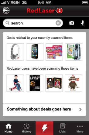
    Redlaser 4.0 Mock

    When we were designing RedLaser 4.0, one of our biggest questions was now to handle navigation. In particular, we weren’t sure where to put the button that launched our barcode scanner. It’s a critical function, but we were adding more features, so we needed to make sure it stood out.

    We put it at the very center of our navigation bar, with a giant scan icon. We made the background red, so that it would really pop.

    Sure, the app wouldn’t boot straight into the scan mode — we wanted users to see all the new features — but we were sure we’d done the next best thing.

    The design failed, horribly, in testing. One user, a long-time RedLaser user, spent fifteen minutes trying to figure out how to launch scanning. She later told us she hadn’t even noticed the button.

    This is a common story in mobile: Complex user interfaces are extremely hard, and a UX change can backfire in unexpected ways. If a button isn’t explicitly labeled and visible above the fold on the home page, it will get exponentially less usage.

    This is a challenge: Phone screens are too small to show an explicit user interface for all but the simplest apps.

    RedLaser isn’t alone in facing this issue. Swarm is a gorgeously designed app from Foursquare. It is the culmination of FourSquare’s efforts to re-envision and dramatically simplify the check in process. To do this, by default it continually broadcasts your current neighborhood to your connections. FourSquare realizes that while this behavior is critical to the app, it can also be really creepy: you don’t always want your friends to know when they’re nearby.

    A very important part of the interface, then, is turning this tracking off. It’s easy, but also a new interaction element: You swipe left-to-right across the top bar and it changes your state:

    FourSquare

    While this interaction approach is easy and smooth, Swarm’s challenged because it isn’t a kind of interaction users expect — and there’s no explicit text to let you know it is even an option. Even savvy mobile users find it hidden:

    https://twitter.com/danielbachhuber/status/474018824857989121

    This leaves developers two choices: Build simpler apps, or teach users.

    It looks like many of the largest companies in mobile are choosing the former. The triumph of Whatsapp is its focus and simplicity — and it is followed by focused apps from eBay, LinkedIn, Amazon, Google, and more. A single-purpose app can create a focused, simple, user-interface.

    A single-purpose app, however, just creates different problems: User acquisition, and user retention. Big mobile companies with their own ecosystems can use apps to feed each other (just like clicking an eBay link in RedLaser will send users to the eBay app). The vast majority of mobile players don’t have this luxury, and user acquisition can be brutally hard. So when you’ve convinced a user to download your app, it needs to be a must-open, home-page-worth app — and this frequently will mean complexity.

    Most app developers can’t afford to fragment their user base. So complex apps need to get user education right.

    User education, however, is hard. The most common approach is to show an overlay on launch, calling out a few critical buttons. In Swarm, FourSquare insisted every user disable and then re-enable location tracking before permitting wider use of the app. Others require users to watch short videos or swipe through pages of text.

    None of this works. Most users in a new app want to get up and running as quickly as they can. We’ve all been guilty of furiously button mashing through tutorials, trying to get to the meat of the app. So what should a designer or product lead do?

    The most impressive user education system I’ve encountered is, surprisingly, for the app Secret. Secret is a social sharing app whitest people anonymously broadcast information.

    Secret uses three complementary approaches to user education

    Method 1: The traditional tutorial

    Secret starts with a traditional user education flow When a user opens the app for the first time, they need to swipe through a series of screens describing the basic operation of the app. This happens before registration, which is important so that users get a sense of how the app works and aren’t driven to close or delete immediately. These screens are extremely simple, focusing on concepts rather than on specific functionality.

    At RedLaser, we found people swipe through this kind of screen extremely quickly. The default assumption should be that the average user will not see this content.

    Method 2: In-line education

    Secret’s first innovation in user training is inline education. The key interface for the app is a user’s secret feed. When a user pauses to read a secret, it is blurred out and a single, focused, explanation of a user interface element appears. These messages are contextually relevant — they only appear when the user pauses to read a message that could benefit from further explanation.

    The advice is effective and powerful because it is highly relevant to the user’s current situation. The messages either suggests a specific action the user can actually take on the secret they’re reading right then, or it provides context for the secret (if not from a friend) which makes the secrets more valuable.

    Exiting these messages requires a click in a small area, and the exit button changes location (following the messages), which means that users can’t quickly skip through the messages.

    Method 3: Spaced Retrieval Therapy

    Secret’s final training method is spaced retrieval therapy. In SRT, you regularly re-expose people to information to lock it into their minds.

    Secret uses this for key pieces of information: How to like secrets by swiping left to right (critical because this determines whether and how secrets are shared), and permissions requests.

    This information is displayed inline, just like a normal secret, which means users are less likely to block the content out (as in banner blindness).

    It isn’t clear when Secret decides to show this information. To most effectively train people about interfaces, they should display the information on a regular pattern with decreasing frequency (e.g., after 1 day, 3 days, 7 days, 14 days, 30 days, etc.). If a user positively responds to the content (for example, by taking the action without prompting), the frequency of reminders can become less frequently.


    For other posts on mobile, read about the trend of increasing apps per company and iOS 8’s major pro-privacy changes.

  • App Disaggregation’s Physical Limit: 30 apps per device

    eBay Marketplaces: 3 apps (Core, Fashion, Motors)
    Facebook: 5 apps (Core, Messenger, Whatsapp, Instagram, Paper)
    LinkedIn: 3 apps (Core, Contacts, Recruiter, and until a few days ago, CardMunch)
    Google: 36 apps (ridiculous)

    Across mobile, the companies most serious about mobile are disaggregating their features sets and building new, more focused, apps. There are compelling reasons to split up your apps:

    • Apps get one chance to get key permissions from the user — push and geo, in particular. With multiple apps, you can ask multiple times, and users might have a clearer understanding of why the permissions are necessary. And if one of a company’s apps annoys users, the users are less likely to totally cut out that company (by revoking permissions in all apps).
    • Smartphone screens are small — even on the largest Android devices. Focused apps can have simpler user interfaces, without hidden features. If a button isn’t visible, most users will never find it. This is why Facebook removed their slide out navigation panel and why Venmo’s right nav surprised me. RedLaser has a left navigation, but we find that users are orders of magnitude less likely to use any features there.
    • Updates take time on iOS. If you’re testing new features which might anger customers or be unstable, it’s better to test in less important apps and eventually roll the best and most stable features into the core experience.

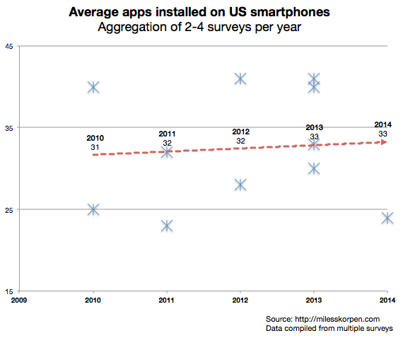
    However, most users don’t have many apps on their devices: Surveys suggest users have only gone from 31 to 33 apps on their devices over the past five years. (See my data here.) Moreover, most of these apps are likely games.

    Average Apps per Device

    If users don’t have more apps, who is using these more focused apps? A few hypotheses:

    • Power-users use anything other than the core apps (and maybe Whatsapp). App manufacturers can create power tools for some users without distracting most of their user base.
    • Apps from powerhouse developers are beating out smaller companies. eBay/Facebook/Google/etc. have a larger share of the install base than they did 4-5 years ago.
    • None of the ancillary apps have significant install bases. They’re purely used for experimentation, and all the successful features will be rolled into the core apps.
    • The cohort of users with smartphones in 2010 might have many more apps installed in 2014 — but the average is weighted down by new late-adopting smartphone users.

    I suspect all these explanations hold a bit of truth. It’ll be an interesting place to watch — particularly because discoverability of installed apps becomes a huge issue once users have 100+ apps. I’m already at the point where any apps off my home screen are accessed via Apple’s built in search feature or Siri.

  • Uber’s business model: What does last month’s SF price decrease mean?

    In January,  Uber announced it was dramatically slashing rates for UberX cars. With the new rates, UberX cars are the lowest priced transportation option I can find in San Francisco.

    Techcrunch and other venues posited that this was a purely competitive move: Consumers were trying out alternative services like Lyft, and Uber needed to be cheaper to compete. While I’m sure that’s part of the story, I think there’s something more going on.

    The ride share service is brutally competitive — and not just on the consumer side. It puts enormous power into the hands of drivers, because people don’t just want low rates but also supply. One impact of this is that the economic surplus will probably accrue to drivers — services will compete to pay them a larger and larger percentage of the total charge just to get them driving for their service, rather than a competitor.

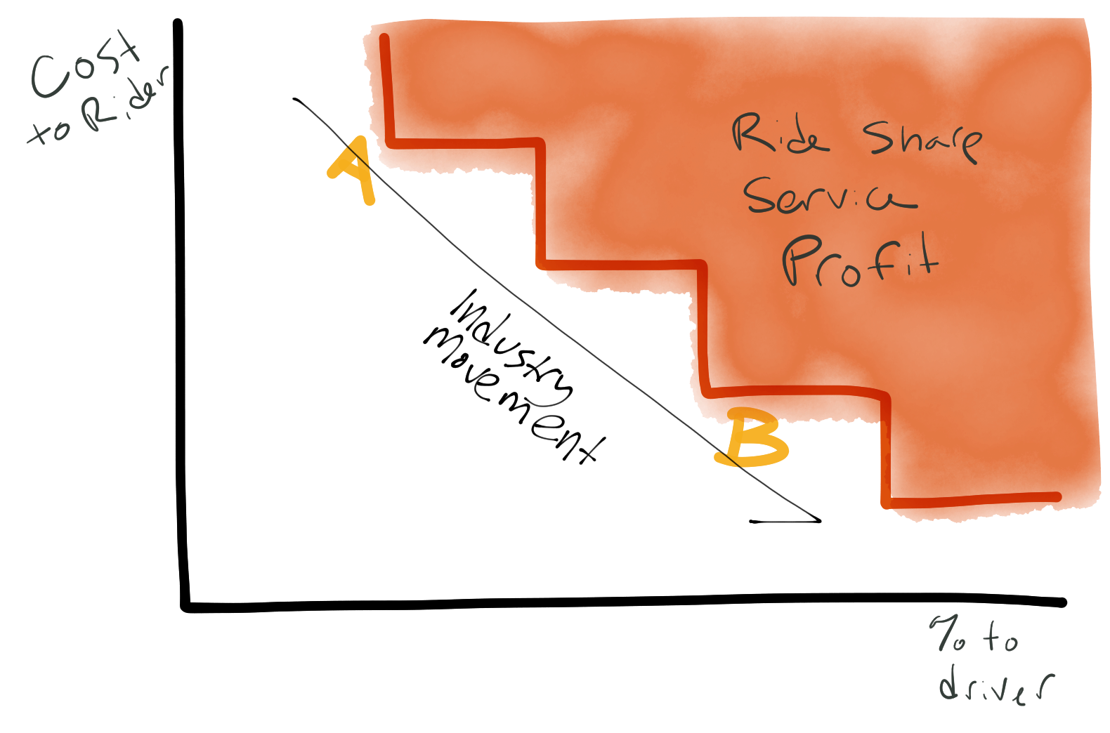
    Moreover, since the people using services like Lyft and UberX are extremely price sensitive, the best way to get new customers is to lower rates. Overtime, you’ll probably see movement like this:

    Profit curve for ride share businesses

    Prior to January, it looked like profit for ride share businesses would slowly decline as prices dropped and drivers took a larger and larger percentage of revenue.

    Uber’s January move changed that — they jumped from A straight to B on my chart, instead of slowly bringing down prices. Since they didn’t reduce the absolute dollar value of driver revenue, the drivers effectively take a higher percentage of revenue.

    So what? Uber just kicked off a price war … because it is one they can win. 

    See, the above curve is  only true for community drivers. Black car services are a totally different market — you differentiate on service and convenience, not  price. This is a market Uber owns.

    Uber’s main concern is about winning marketshare & press in the broad taxi service (possibly because they see a future with driverless cars, where capital is more important than labor, and they’ll win back their profit margin), and about making money via Uber black car. 

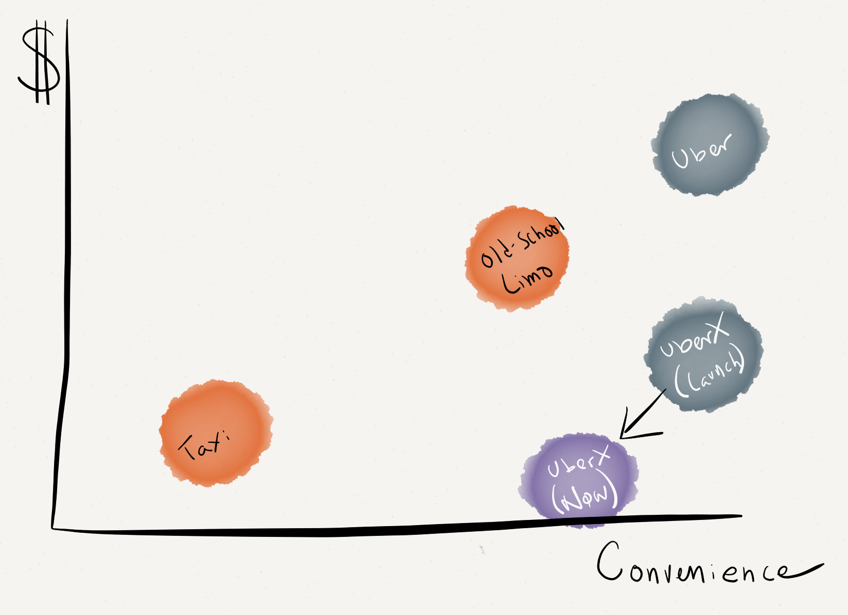
    Which gets to another reason for the price decrease: To better differentiate its services: Uber vs. UberX.

    Uber Business Model

    Prior to this price decrease, Uber had better service but otherwise wasn’t much different — a bit more expensive.

    By lowering prices (and forcing its competitors to do the same), Uber actually might have reduced the number of cars on the road. Suddenly there is a huge competitive advantage for the black car service — they’re simply more available, all the time.